Since there introduction the usage of round avatars has always been a controversial topic, like marmite, seems people either love them or hate them. I for one welcome them but I’ve always wondered why? Is it just personal preference or was there an underlying reason.
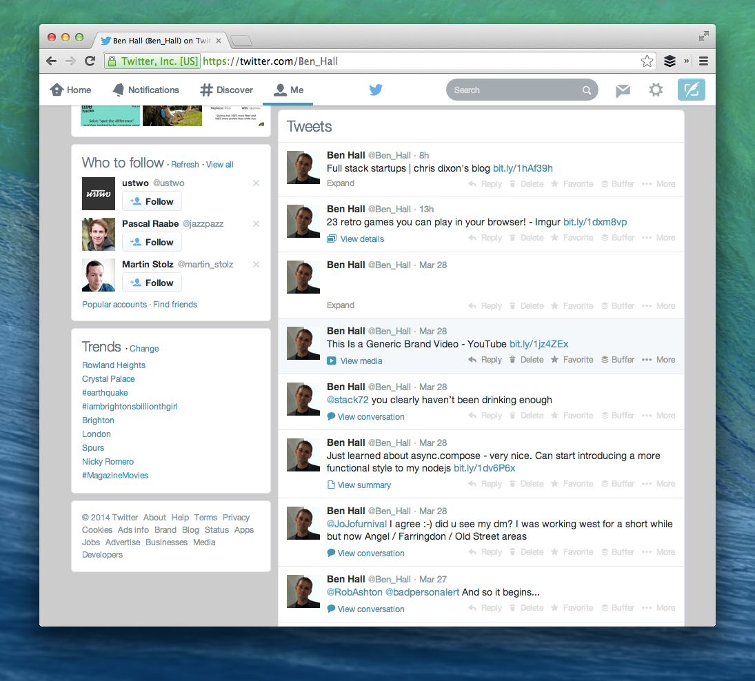
To understand this I started to look at how other websites approach avatars. Twitter for example has taken an interesting approach as it’s not fully committed to round avatars but it does have a very slight roundness.

While the roundness is subtle, without it timeline looks very different and quite jarring (definition: “incongruous in a striking or shocking way; clashing.” Incongruous: “Not in harmony or keeping with the surroundings or other aspects of something”)
To make it a easier to spot, here is a side-by-side comparison.
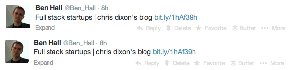
If we use the same style as Path or Dribbble then, for me, the avatars feel more natural, easier on the eyes and are more aligned with the rest of the interface.
But why?
After some research it turns out we’re pre-programmed to prefer rounded corners. As children we’re quickly taught that sharp corners are dangerous and hurt but rounded corners are safer and friendly.
Another reason is that the flowing nature of a circle and rounded corners take less cognitive effort, or brain power, to visually process. The less brain power required the easier user interfaces are to use, as described in the book “Don’t Make Me Think”.
Finally, the box appears to make you focus on the outline instead of the content inside. By using rounded corners the brain is less distracted and as such we process the important information.
How does this look in reality? With Missing Unicorns I originally had everything as a square but I wasn’t happy with it.
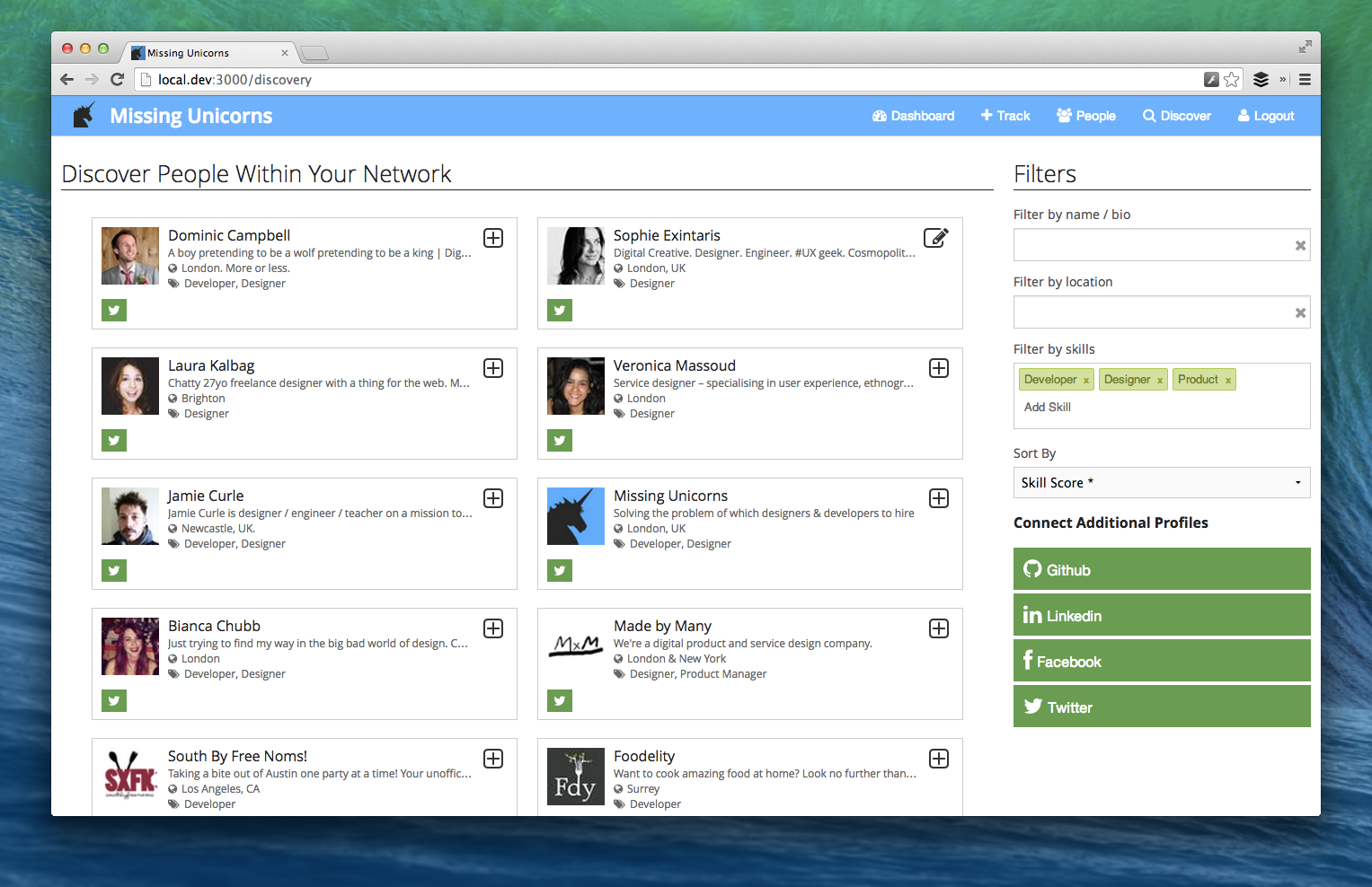
By taking into account why rounded corners look better for users I made a number of modifications as shown below.
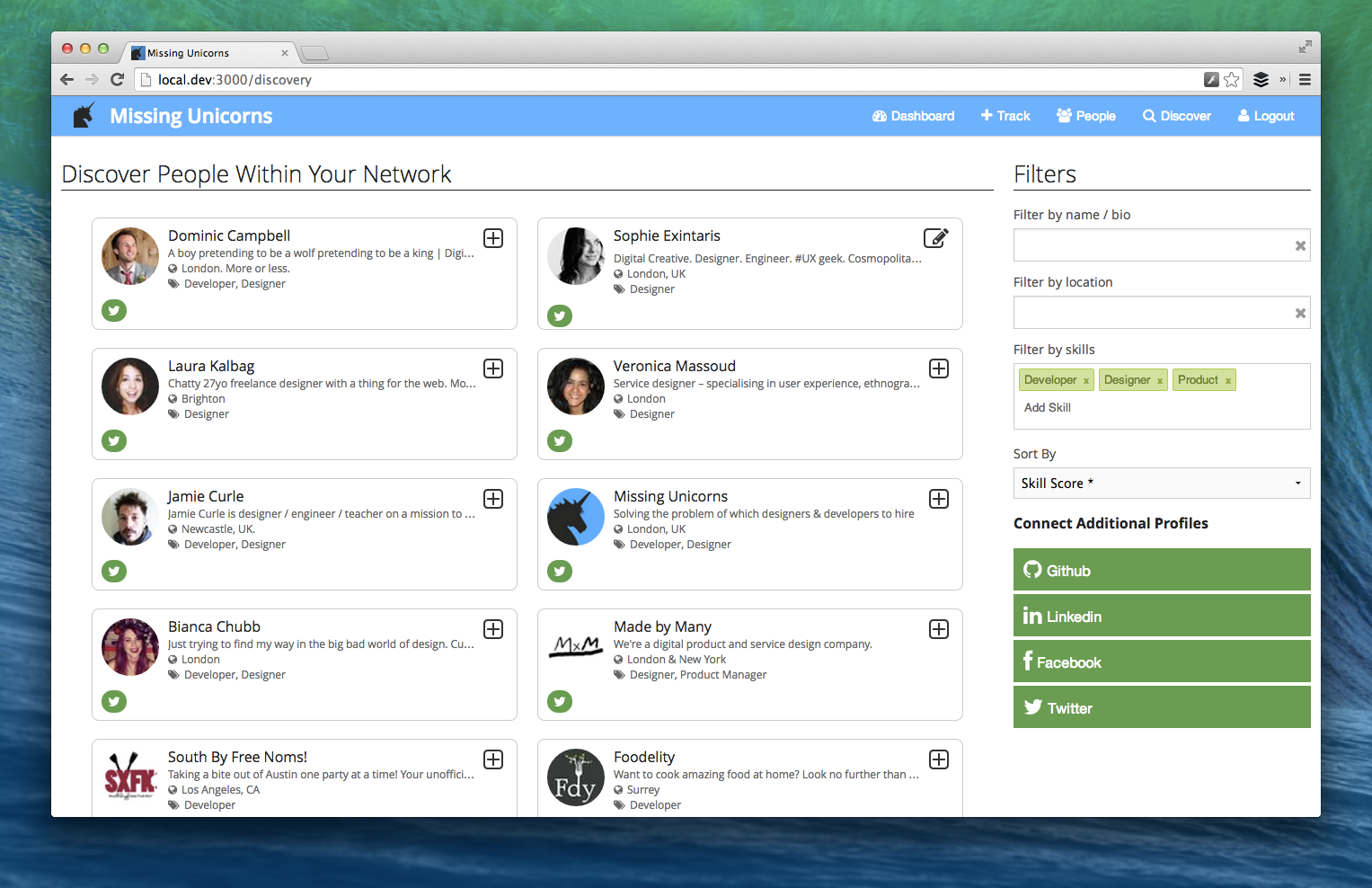
The changes include:
1) A subtle roundness added to the outline of each person’s panel to draw attention inside.
2) The avatars are rounded to reduce the processing, especially considering the number of them on the screen, and to draw focus to the face.
3) Changed the social network connected icon to make it softer.
Personally, I’m much happier with this approach but really want to hear feedback from you. Sign up for a private beta test at http://www.missingunicorns.com/
Finally, I’m looking at building a new tool focused around Product Design and UI/UX. If you’re interested in hearing more and would like to be considered for beta testing a new product then sign up below: