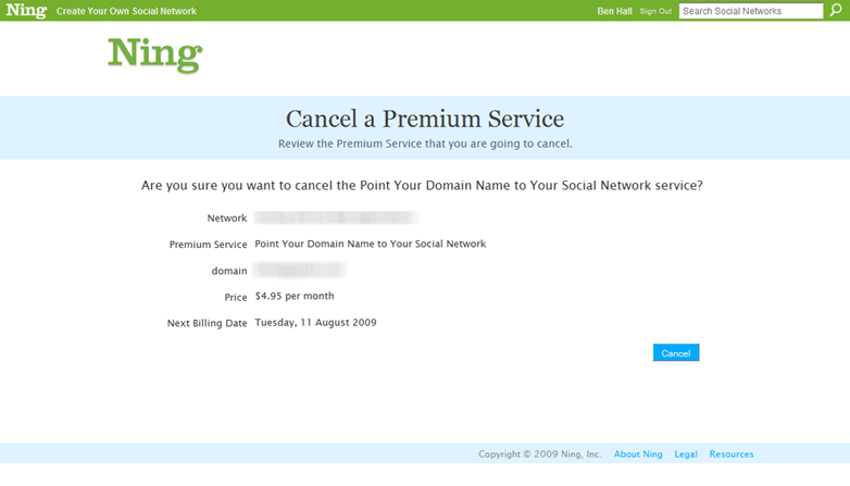
I’m currently on a cut-costing exercise and one of the items which needed to go was a premium Ning service. Priorities changed, aims changed and as such it was no longer required.
Finding how to cancel the service was pretty simple task. However, once I was there I felt something was missing. Notice anything from the screen below?
In my mind, Cancel is a way of backing out of a decision. In this case, it was a way to confirm.
Logically, it made sense – you are explicitly clicking cancel. However, based on how every other application works I was expecting an OK or Yes button to appear next to it.
It is important to think about what users are expecting to see together with how certain terms might have more than one possible meaning.

Was it anything to do with this article that flashed by HN the other day? 🙂
http://www.chartingstocks.net/2009/03/ning-exposed-tech-company-ning-scams-its-clients/