How I run Blog.BenHall.me.uk and other sites using Docker (January 2015)

Over the past few months I’ve migrated a number of my websites including Blog.BenHall.me.uk to containers and Docker. The main motivation was to reduce the cost of hosting different websites, APIs and databases while allowing me to quickly bring online new domains/sites for testing.

At the start of the 2014 I hosted everything on Rackspace however as my circumstances and the products I worked on changed I looked elsewhere. Having moved away from PaaS offerings like Heroku and Azure due to inflexibility and performance I’ve found a nice home hosting with Digital Ocean. Their performance is amazing and the cost is incredible plus they have a London data centre. My personal referral link will give you $10 credit to get started so you can see the benefits for yourself. For small instances this is equal to one or two months free.

With Digital Ocean I can use Docker where as before I ran a standard Ubuntu, Nginx, WordPress and MySQL configuration. With Docker I still have Ubuntu as the base OS image to keep the configuration simple. For WordPress and MySql I use the official images. The configuration is very straight forward with environment variables and links used to communicate between the two containers. For Nginx I used to use the official repository, however creating configuration files took time and wondered if there was a simpler solution that could take advantage of Docker. The result is Nginx Proxy, an open source project that automates the configuration of Nginx based on Docker metadata. By defining a VIRTUAL_HOST environment variable I can expose a container via Nginx without needing to craft separate configuration files.

While Nginx Proxy is great for a single host but it didn’t support default hosts meaning any domain mapped to the server but without a Nginx setting would return 503. With a simple modification to the Nginx Proxy script I was able to define a DEFAULT_HOST for the server. The change is available at https://github.com/BenHall/nginx-proxy/tree/default_host and https://registry.hub.docker.com/u/benhall/nginx-proxy/

With the combination of Digital Ocean, Nginx Proxy, WordPress and MySQL I have a flexible server to meet my needs with very little maintained required. To ensure my blog is available I use Uptime Robot and Cloudflare.

When I need to bring a new website online I simply point the domain to the server via Cloudflare, create a container which is run with the VIRTUAL_HOST variable. Nginx is automatically configured to handle the new domain. If I don’t have a site available then it’s just parked at my personal blog.

Running NancyFX inside a Docker container

A number of years ago I described how to run a NancyFX based application on Heroku via Mono. Recently I’ve been focusing my attention on Docker and considered the same problem, how can you run NancyFX as a Docker container? At a high level, a Docker container is an isolated process comprising of the application and it’s direct dependencies. With everything isolated we can manage multiple containers more effectively. More details can be found at https://www.docker.com/whatisdocker/

It turns out to be fairly straight forward. Firstly you need a Docker image with Mono installed which I’ve previously built and made available an image at https://github.com/BenHall/docker-mono

This image can be used as the foundation for the Nancy project we want running inside the Docker container. A Docker container is baed on an image that can be pre-built and shared. These images are created based on a Dockerfile, a set of commands that are executed in order to configure and run the application.

A Dockerfile for a NancyFX first needs a base Docker image. In this case we’re using the image created with Mono installed.
FROM benhall/docker-mono

We then copy the source code for the application into it’s own directory.
COPY . /src

Setting the working directory ensures that future commands are executed from inside this folder
WORKDIR /src

Using xbuild we can compile our project
RUN xbuild Nancy.Demo.Hosting.Docker.sln

As the application is sandboxed and isolated we need to expose any ports which we want to be accessible. In this scenario the self-hosted web app maps to port 8080
EXPOSE 8080

Finally, when the container boots up we can specify which application needs to run.
ENTRYPOINT ["mono", "src/bin/Nancy.Demo.Hosting.Docker.exe"]

This is everything required to define a Docker image capable of running a Nancy project. The complete file can be found at https://raw.githubusercontent.com/BenHall/nancy-demo-hosting-docker/master/Dockerfile

To launch the container we first need to build the image. This image can be reused, shared and made available for other environments or people to use. Using the -t we can define a friendly tag to help recognise the image followed by the path to the repository or directory containing the Dockerfile
$ docker build -t benhall/nancy-demo-hosting-docker github.com/benhall/nancy-demo-hosting-docker

Once built the image can be started as a container with port 8080 accessible.
$ docker run -d --name nancy-demo -p 8080 benhall/nancy-demo-hosting-docker

Inside the container the NancyFX site is up and running. The docker port command tells us the port number of the host mapped to the port inside the container. This allows us to run multiple identical containers on a host as they’ll all be assigned different ports.
$ docker port nancy-demo 8080
0.0.0.0:49153

A quick curl and you can see the Nancy and Mono response headers from inside our container.
$ curl -I 0.0.0.0:49153
HTTP/1.1 200 OK
Nancy-Version: 0.9.0.0
Content-Type: text/html
Server: Mono-HTTPAPI/1.0

While this is a simple example it demonstrates the starting point of how you can create isolated and repeatable containers for different parts of your software stack. With the recent announcement that Microsoft and Docker are working more closely together this is here to stay and the future of how we deploy software. If you’re interested in hearing more then I’m speaking on “Architecting .NET Applications for Docker and Container Based Deployments” at NDC London in December. Alternatively please feel free to email me (Blog @ BenHall.me.uk) or via Twitter (@Ben_Hall)

Why do round avatars look better than square avatars?

Since there introduction the usage of round avatars has always been a controversial topic, like marmite, seems people either love them or hate them. I for one welcome them but I’ve always wondered why? Is it just personal preference or was there an underlying reason.

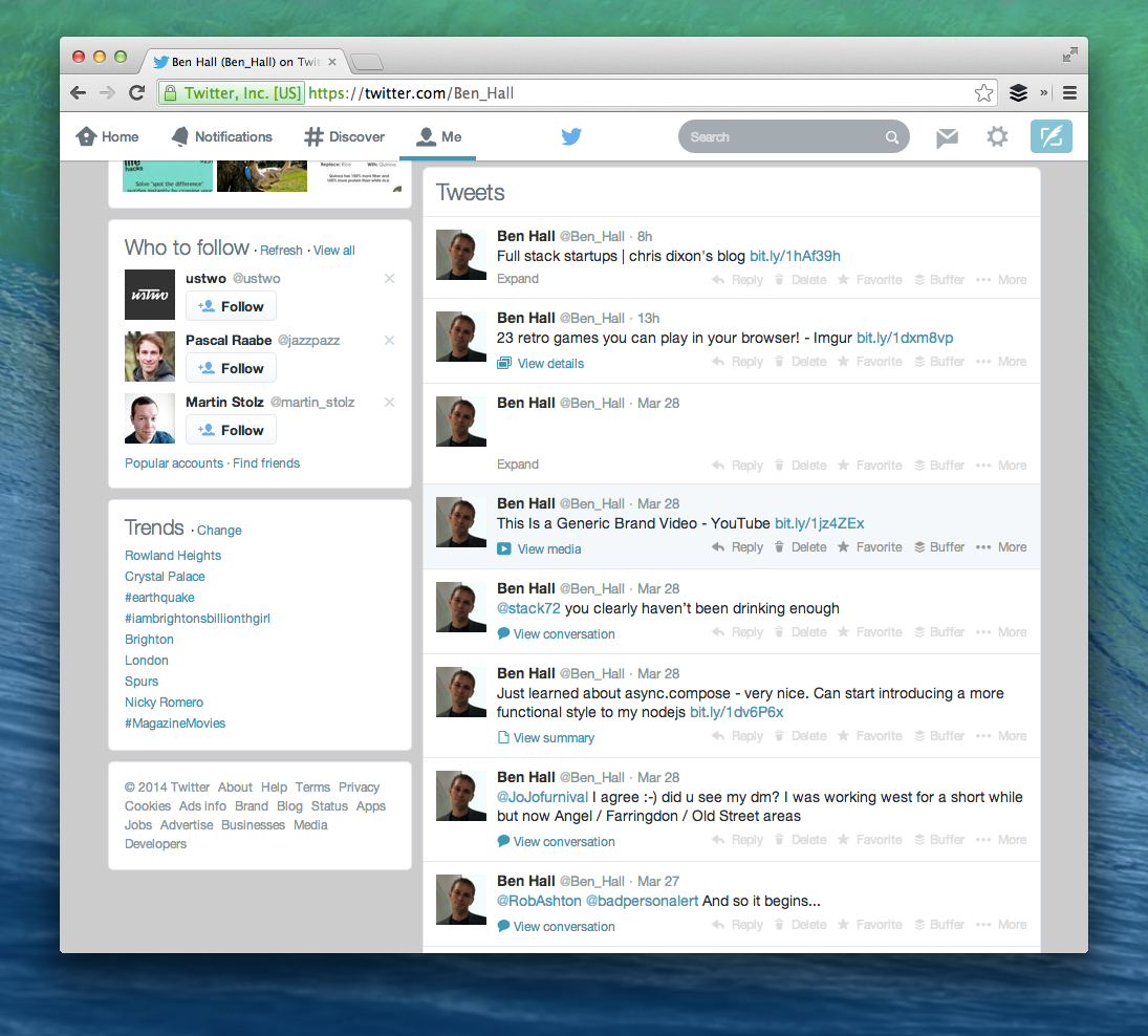
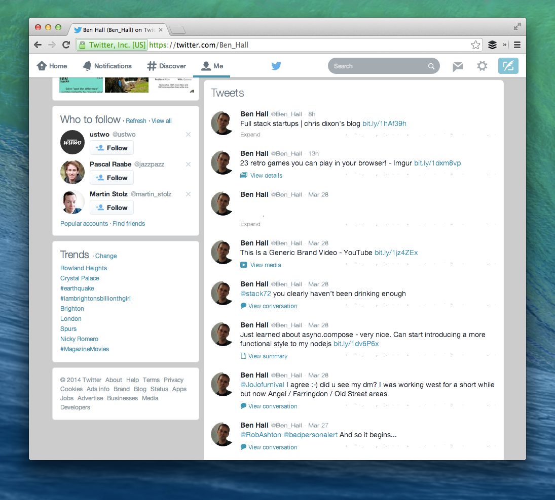
To understand this I started to look at how other websites approach avatars. Twitter for example has taken an interesting approach as it’s not fully committed to round avatars but it does have a very slight roundness.

Twitter with slightly round avatars

While the roundness is subtle, without it timeline looks very different and quite jarring (definition: “incongruous in a striking or shocking way; clashing.” Incongruous: “Not in harmony or keeping with the surroundings or other aspects of something”)

Twitter with square avatars

To make it a easier to spot, here is a side-by-side comparison.

If we use the same style as Path or Dribbble then, for me, the avatars feel more natural, easier on the eyes and are more aligned with the rest of the interface.

Twitter with round avatars

But why?

After some research it turns out we’re pre-programmed to prefer rounded corners. As children we’re quickly taught that sharp corners are dangerous and hurt but rounded corners are safer and friendly.

Another reason is that the flowing nature of a circle and rounded corners take less cognitive effort, or brain power, to visually process. The less brain power required the easier user interfaces are to use, as described in the book “Don’t Make Me Think”.

Finally, the box appears to make you focus on the outline instead of the content inside. By using rounded corners the brain is less distracted and as such we process the important information.

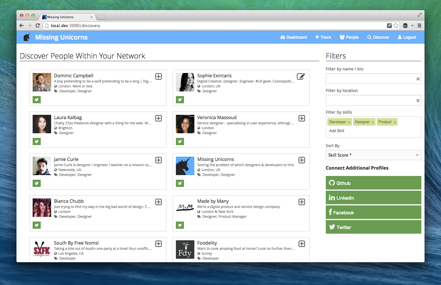
How does this look in reality? With Missing Unicorns I originally had everything as a square but I wasn’t happy with it.

Missing Unicorns - Square version
Missing Unicorns – Square version

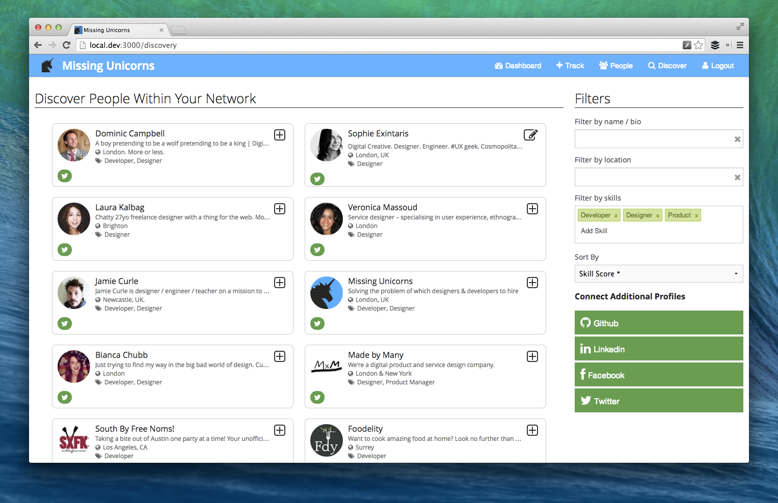
By taking into account why rounded corners look better for users I made a number of modifications as shown below.

Missing Unicorns - Round Version
Missing Unicorns – Round Version

The changes include:
1) A subtle roundness added to the outline of each person’s panel to draw attention inside.
2) The avatars are rounded to reduce the processing, especially considering the number of them on the screen, and to draw focus to the face.
3) Changed the social network connected icon to make it softer.

Personally, I’m much happier with this approach but really want to hear feedback from you. Sign up for a private beta test at http://www.missingunicorns.com/

Finally, I’m looking at building a new tool focused around Product Design and UI/UX. If you’re interested in hearing more and would like to be considered for beta testing a new product then sign up below:


Implementing Twitter Cards for WordPress and Ghost blogs

Twitter cards are everywhere but I realised I hadn’t added them to either of my blogs, Ben Hall and Missing Unicorns. There are two main categories of twitter cards, one is free and based on metadata to provide context to a link while the others can be classed as lead generation cards that allow you to collect email addresses and twitter handles when the user submits a button. The metadata card is free, the lead generation card are paid ad campaigns. In this post I’m just focusing on the free version.

The documentation for the cards can be found at https://dev.twitter.com/docs/cards and works in a very similar way to Facebook’s Open Graph. Twitter tells us “Simply add a few lines of HTML to your webpages, and users who Tweet links to your content will have a “card” added to the Tweet that’s visible to all of their followers.” Sounds sensible, let’s do that.

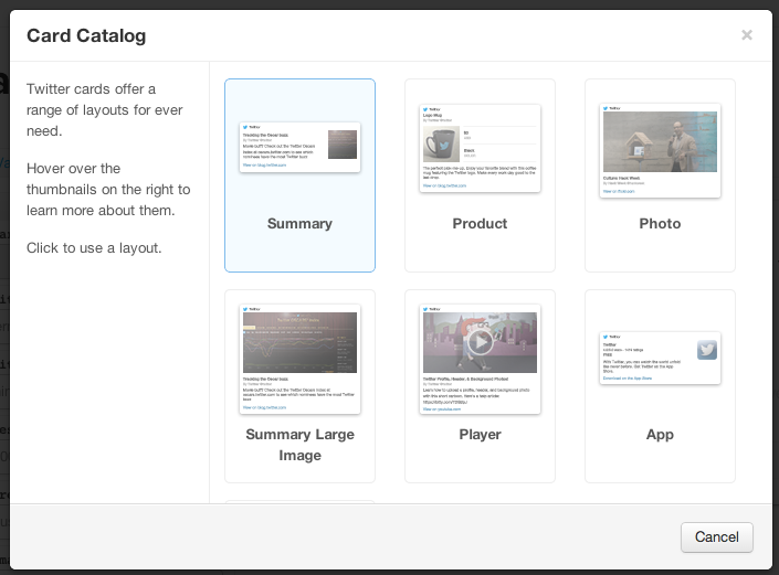
Twitter offers 7 different styles of layout depending on the contents requirements, in the case of a blog the summary style fits most requirements.
Card Validator | Twitter Developers

The Data Attributes

For the summary card there are only three required attributes:
The card type                <meta name=”twitter:card” content=”summary”>
The card title                 <meta name=”twitter:title” content=”Did you miss my recent announcement? Missing Unicorns didn’t.”>
The card description      <meta name=”twitter:description” content=”Recently I mentioned I was “between startups”, a situation that lasted five days. From my experience of hiring this is an all too common occurrence. By the time you hear that someone is looking for work they’re already gone – the situation is almost as bad as flat hunting in London.”>

The other parameters are optional, but the chances are you would want to include as they help the card feel more complete and polished.
Site’s twitter handle                   <meta name=”twitter:site” content=”@missingunicorns”>
Author’s twitter handle               <meta name=”twitter:creator” content=”@ben_hall”>
The domain name of the site     <meta name=”twitter:domain” content=”MissingUnicorns.com”>
An image for the blog post         <meta name=”twitter:image:src” content=”http://placekitten.com/250/250″>

Adding Card to WordPress

To include the metatags on a WordPress blog you can either include the attributes manually or use the plugin http://wordpress.org/plugins/twitter-cards/. When I attempted to use the plugin it required FTP functionality which was more effort than I wanted so was dropped.
If you manually edit the theme by going to the theme editor in the admin console then you can start tweaking the raw PHP. The file header.php contains the all important <head> block where to include the above tags.

In order to render content related to the page in question we need to understand a little more about WordPress’s API. If we take this blog post as an example:

http://blog.benhall.me.uk/2014/03/job-boards-are-the-past-its-time-to-rethink-recruitment/

The ideal meta data would look something like this
<meta name=”twitter:card” content=”summary”>
<meta name=”twitter:title” content=”Ben Hall&#039;s blog – I don&#039;t know darling, I&#039;m doing my work”>
<meta name=”twitter:description” content=”Job Boards Are The Past! It&#8217;s Time To Rethink Recruitment”>

Thankfully, there is already existing tags containing that data so it would just a simple case of copying the php code
<meta name=”twitter:card” content=”summary”>
<meta name=”twitter:title” content=”<?php bloginfo(‘name’); echo ” – “; bloginfo(‘description’); ?>”>
<meta name=”twitter:description” content=”<?php single_post_title(”, true); ?>”>

After saving the page all blog posts on WordPress will have the correct metatags for twitter cards.

Adding Card to Ghost

At the time of writing Ghost doesn’t have any plugin support meaning the only option is to manually modify the theme.

The file you’re interested in is default.hbs which lives within content/themes/casper of the deployment.

In a similar way to WordPress, we need to add the tags that will display the correct information for each individual post.

<meta name=”twitter:card” content=”summary”>
<meta name=”twitter:title” content=”{{@blog.title}}”>
<meta name=”twitter:description” content=”{{meta_title}}”>
<meta name=”twitter:domain” content=”http://missingunicorns.com/blog”>
<meta name=”twitter:site” content=”@missingunicorns”>
<meta name=”twitter:creator” content=”@ben_hall”>

This would produce the following

<meta name=”twitter:card” content=”summary”>
<meta name=”twitter:title” content=”Missing Unicorns Blog”>
<meta name=”twitter:description” content=”When was the last time you asked ‘Why wouldn’t I use my product’?”>
<meta name=”twitter:domain” content=”http://missingunicorns.com/blog”>
<meta name=”twitter:site” content=”@missingunicorns”>
<meta name=”twitter:creator” content=”@ben_hall”>

Now, we just need to tweet and link and it should all work nicely.

It’s broken! Nothing shows up when I tweet a link

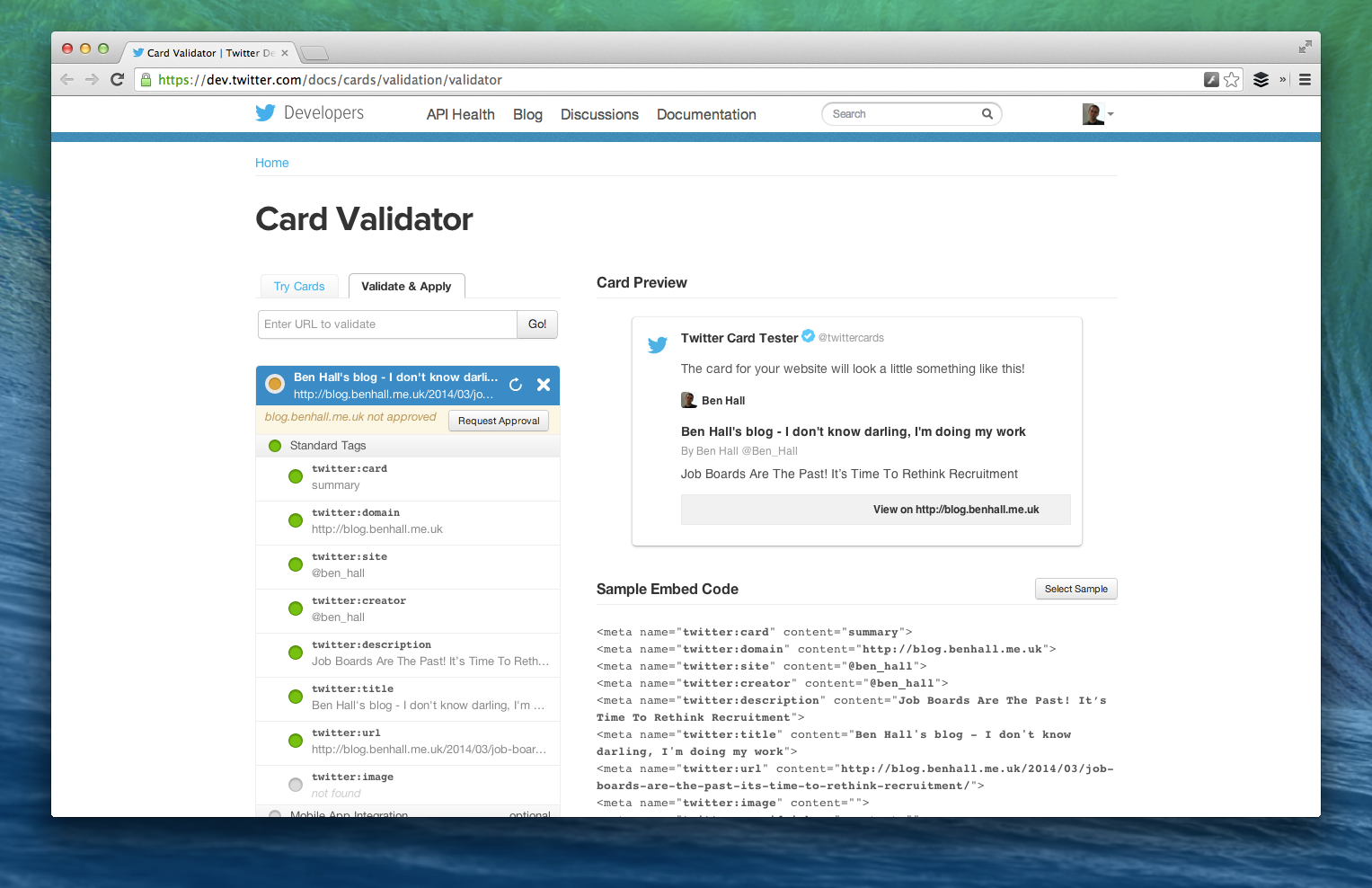
Yep, I thought I had done something wrong. In fact, all cards need to be approved by twitter via the Card Validator. Turns out this is also a great way to test your meta tags without needing to tweet links to your site.

Approving Cards

The validator is very simple. Given a link to a tag with the tags, it will parse and render the card as if it was in the twitter timeline. Once you’re happy, you submit it for approval.
Card Validator | Twitter Developers-3

Once you’re happy, submit the example URL and your twitter details for approval. The confirmation says Twitter’s turnaround time is a few weeks for approval but both of mine were done within a matter of minutes and how showing in a twitter stream near you at @Ben_Hall and @MissingUnicorns